Nuxsol
Start a conversation

Worknuxsol.eu/work/map-it/

A studio site with a planner built in.

The website of Map It, built in Framer and extended with code components: a project planner, a guided map of how it works, and project pages drawn as maps.

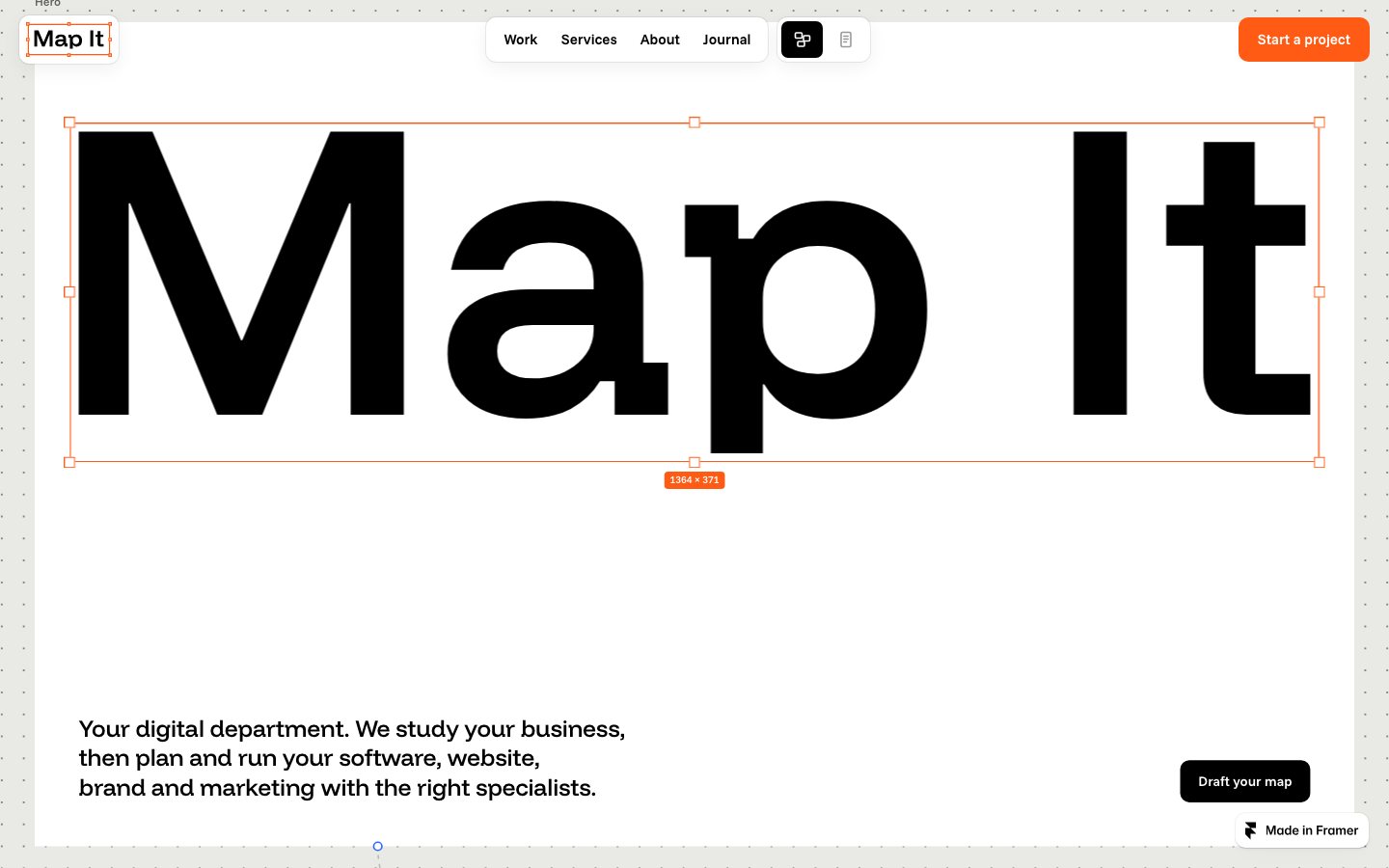
The home page of the Map It site: the name set very large inside a selection frame.
The home page: the site looks like a design canvas, with frames and handles.
Sector
Studio website
Year
2026
Project
Map It
Client
Map It
Design
Map It
Development
Nuxsol
Starting point
The Okapi template for Framer
Services
Development

Map It plans and runs digital work for companies, with specialists the client chooses. Its site had to show that way of working, not only describe it. Map It designed the site. Nuxsol built it in Framer and wrote the components that Framer does not provide.

In the project

  • Framer site for desktop, tablet and phone
  • Project planner
  • Guided map of how it works
  • Project pages generated from content
  • Canvas, frames and notes as components

The case

The problem

A studio that sells planning needs a site that plans. A list of services and a contact form would say what every other studio site says. Map It wanted a visitor to leave with something: a first plan for their own project.

Framer gave the team a site they can edit themselves, but its standard parts stop at pages, text and images. The planner, the guided walk through the process and the project pages laid out as maps had to be written.

What we built

The site runs on Framer and started from the Okapi template. Its pages look like a design board, with frames, handles and notes. On top of that sit the code components we wrote. The largest is the planner on the home page, which takes a visitor from a starting point to a plan they can send. Project pages are generated from the content system, so a new project needs content, not a new layout.

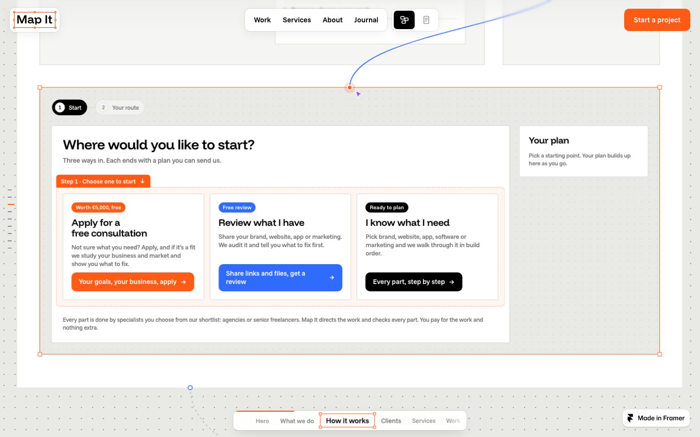
The planner on the Map It home page, with three ways to start and a plan panel.
The planner: three ways in, and a plan that builds up beside them.

Who it is for

  • The visitor with a projectWants to know what it would involve before a first call.
  • The Map It teamEdits pages and adds projects. Needs to do it without a developer.
  • The visitor on a phoneNeeds the same planner and maps on a small screen.

What we did

By service: what was used in this project, and the steps of execution.

Development

The design, built exactly.

Clean code that brings the design to life: fast, responsive and exact on every device, with a back end you can rely on.

  • Front-end
  • Framer
  • React
  • CMS integration
  1. 01

    Build the pages in Framer

    Home, work, services, about and journal, from the Okapi template, for desktop, tablet and phone.

  2. 02

    Write the components

    React code components for the planner, the maps, the canvas and its handles.

  3. 03

    Connect the content

    Projects, with their boards and steps, come from Framer’s content system.

  4. 04

    Test and publish

    Components are tested outside Framer first, then on the published site.
Build decisions

Each with the reason for it.

  1. 01

    Build on Framer, extend with code.

    The team edits text, images and projects themselves. Code is added only as components that sit inside Framer pages.

  2. 02

    The planner comes first.

    “Draft your map” is the main button in the hero, and it leads straight to the planner.

  3. 03

    Project pages come from content.

    Each project is an entry with its boards, steps and captions. The page, its gallery and its map are generated from that entry.

  4. 04

    The page walks with the visitor.

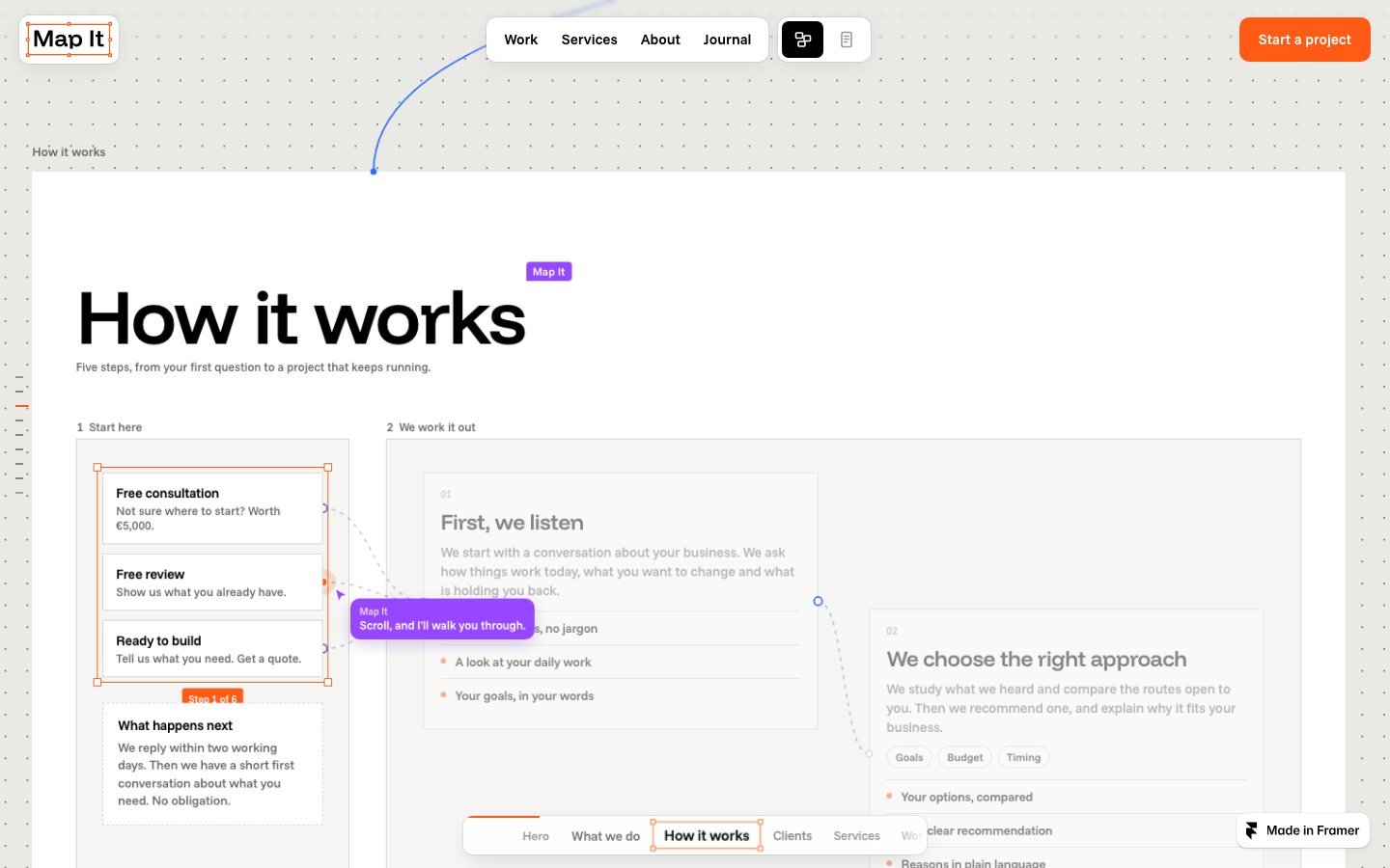
    On the map of how it works, a note follows the scroll and names the step in view, so a long section reads as a sequence.

The how it works section of the Map It site, drawn as a map with a note that follows the scroll.
How it works, drawn as a map with a note that follows the scroll.
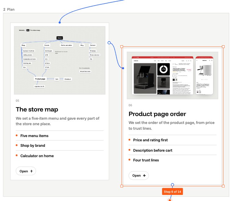
A project page on the Map It site with a gallery rail and the steps of the project.
A project page, generated from one content entry.

The system

Four tones, each with one job. Contrast is measured, not judged by eye.

  • Ground#E9E9E6Warm grey: the canvas behind every page.
  • Ink#000000Black: text and the main buttons.
  • Signal#FF5B14Orange: selection frames, the active step and the start button.
  • Soft#FFFFFFWhite: boards and cards.
Contrast ratios of the palette
PairContrastPasses
Ink on ground17.3 : 1AAA
Ink on soft21.0 : 1AAA
Label on signal3.1 : 1AA for large text
Signal on ground2.6 : 1Marks and frames, not text
Type
Funnel Display for headings.
Voice
Plain questions, no jargon.

How it works

  1. 01

    Start

    A visitor chooses one of three ways in: a consultation, a review of what they have, or a plan for what they need.

  2. 02

    Your route

    They answer in build order, and the plan builds up beside the questions.

  3. 03

    Send

    The plan goes to Map It as the brief for a first call.

The principle

A site that plans, for a studio that sells planning.

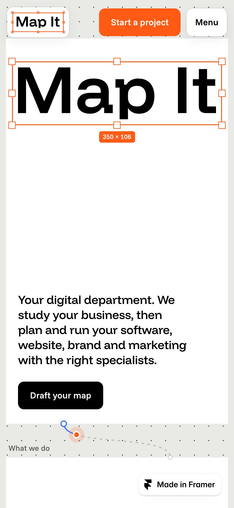
The Map It home page on a phone.
The home page on a phone.

What it is built to change

  • Plans draftedA visitor who drafts a plan arrives at the first call with a brief. The number of plans sent is the measure.
  • Edited without a developerNew projects and page changes are made in Framer by the team.
Next case This site.

Show us the page you want machines to understand.

Send us one URL. On the first call we tell you, for free, what a person and an agent each find there, and roughly what it would take to fix.